Brand identity
FP (Four Principles) are a management consultancy specialising in complex operational and digital transformation projects. With most of their clientbase referring to them as ‘FP’ and a desire to modernise and simplify their brand identity, it was time to drop the ‘Four Princliples’ and formally adopt the shortened name as their brand name.
Deliverables
- Brand identity
- Brand workshop
- Brand positioning
- Brand guidelines
- Photography
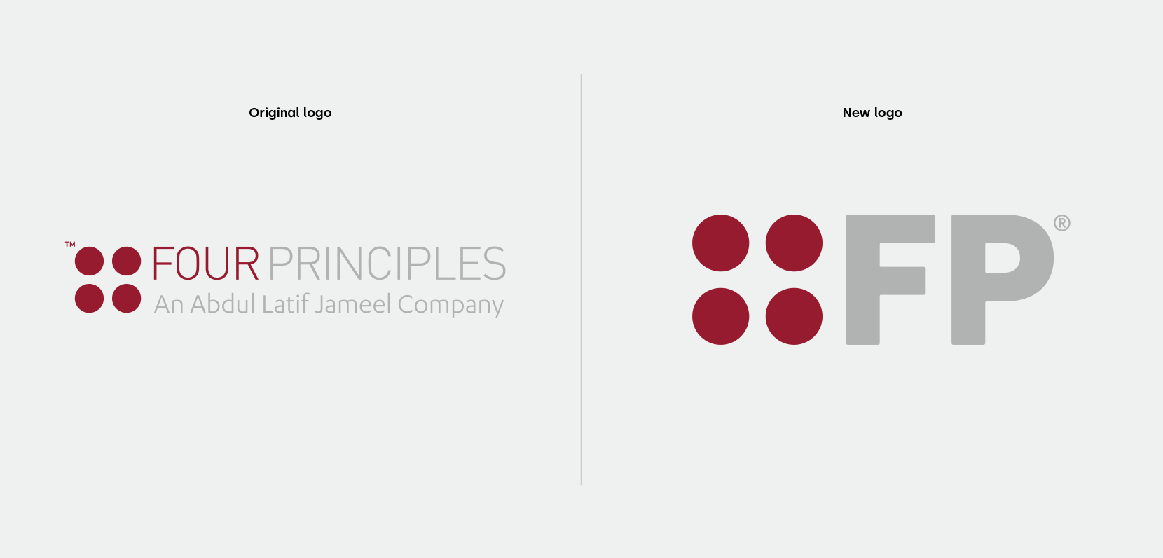
They help their clients streamline processes, organisational structures, products and services by consulting, and more importantly, implementing pragmatic, tailored solutions. The same principles were used when redesigning the logo.


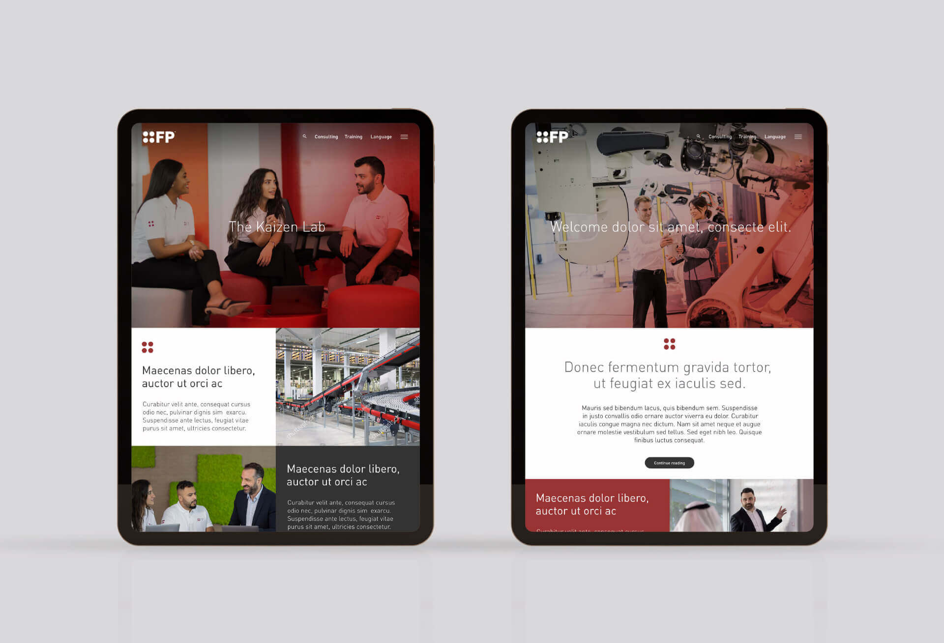
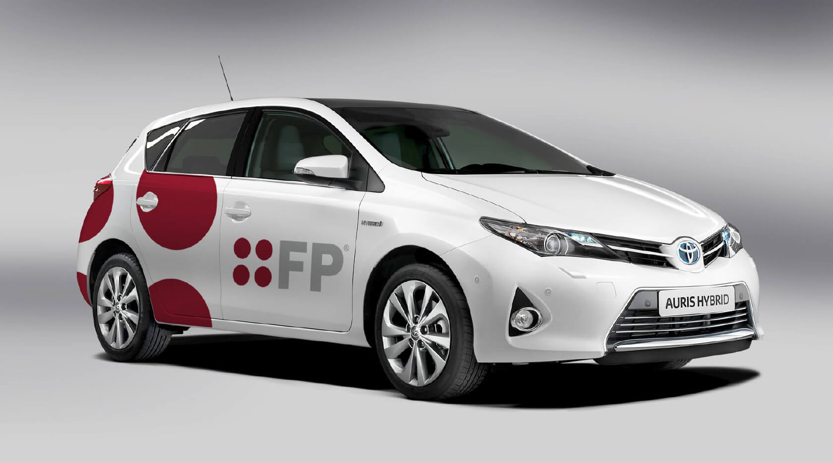
The brand graphic, derived from the logotype’s four circles, is used across all of FP’s marketing materials, creating a strong visual language, consistency and harmony.


A brand proposition was developed that positions FP as ‘doers’, and also captures their straight-to-the-point, no-nonsense personality. FP’s most important differentiator is a ‘sleeves up, stuck in’ approach. They go into businesses to actually put plans into motion. It’s talk, backed up by real action.

The brand guidelines were updated to reflect the new brand identity and positioning.
As part of the FP rebranding process, a bank of imagery was created, providing photographic assets to support the redevelopment of the website, as well as ongoing marketing, social and recruitment communications. The overall tone of the photography reflects a serious consulting business, but also one that respects human values. The imagery captures the environment, personality, culture and the way in which FP does business.

