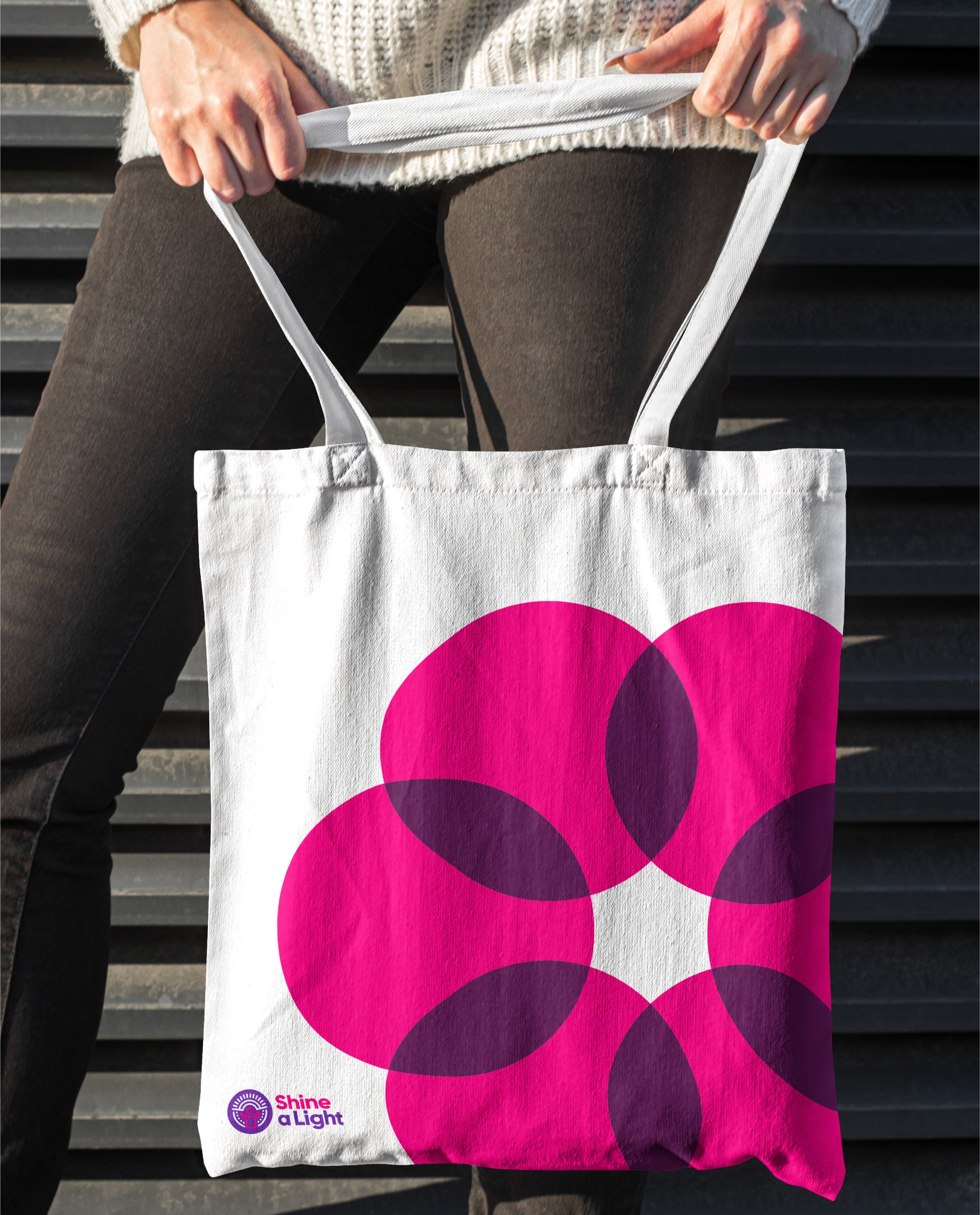
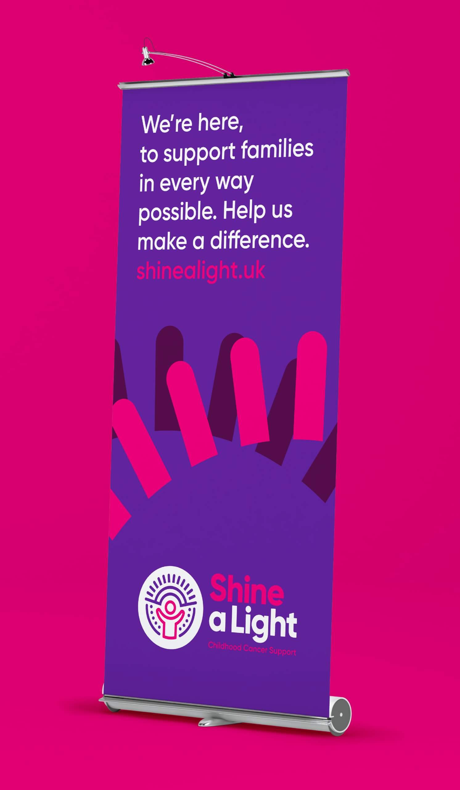
Brand Identity
Shine A Light is a local charity dedicated to supporting families affected by childhood cancer. Like many organisations of its kind, all of its time and effort goes into providing services and being there for patients. As a result, the charity’s branding – a key element in its ability to raise funds and awareness – had taken a back seat.
Deliverables
- Brand identity
- Website
- Photography
- Stationery
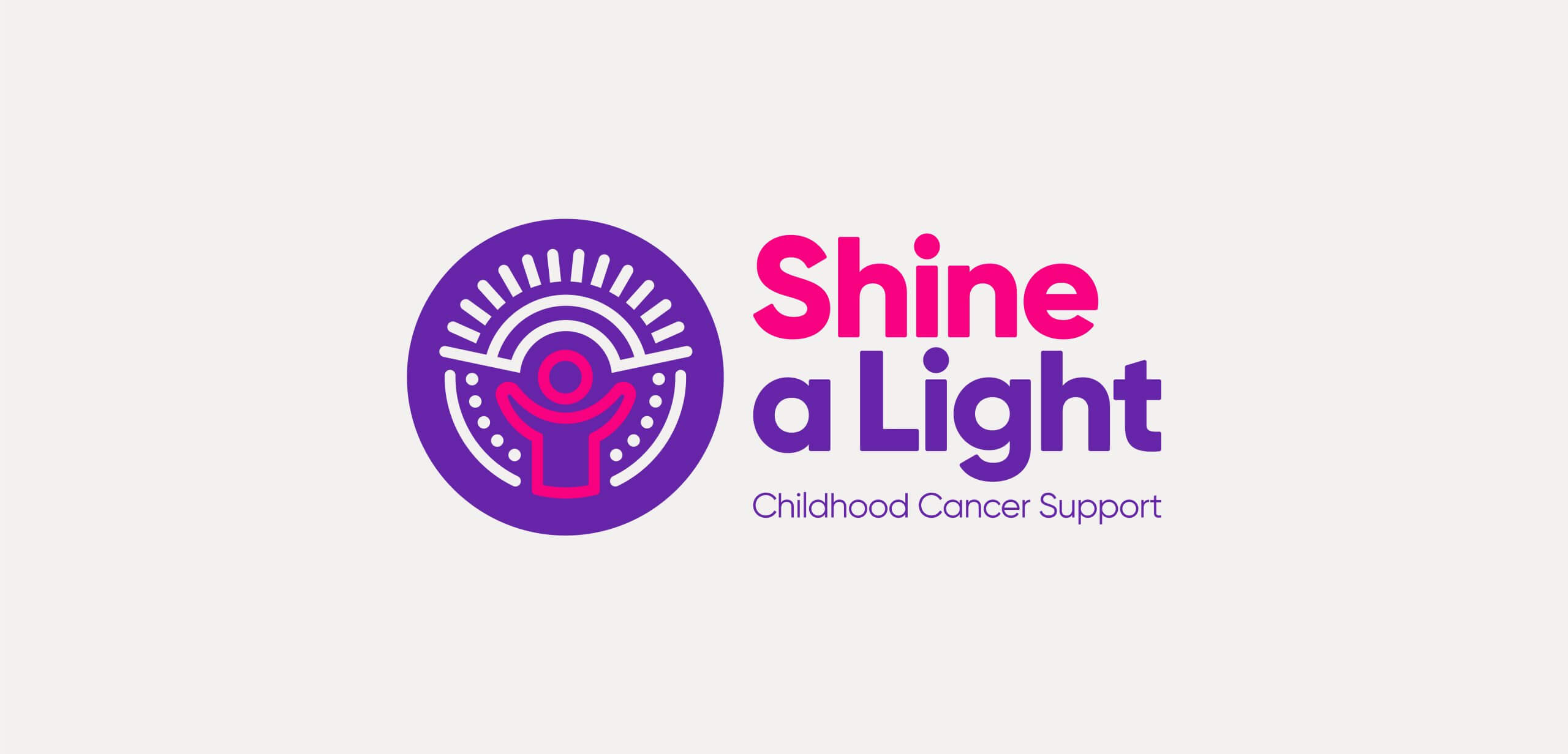
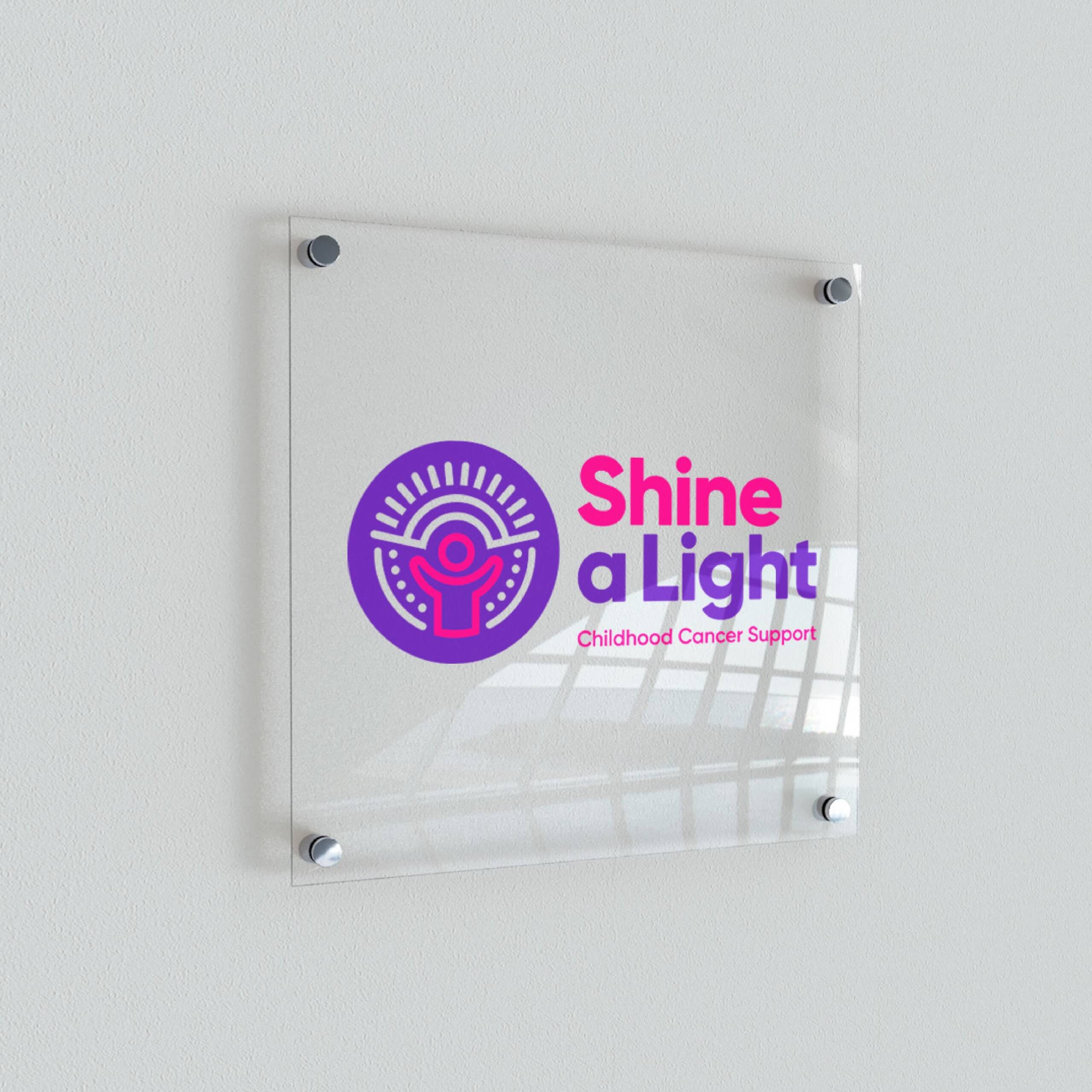
We evolved the charity’s existing logo to create a fresh, recognisable brand identity, using a tribal style icon to symbolise the close-knit community at the heart of Shine a Light. The vibrant colour palette helps to strengthen the message of positivity and supports the creation of bold design across multiple channels.


Across each touch point, the new brand identity uses a playful graphic language, symbolising a radiant light that encompasses the services Shine a Light provide.
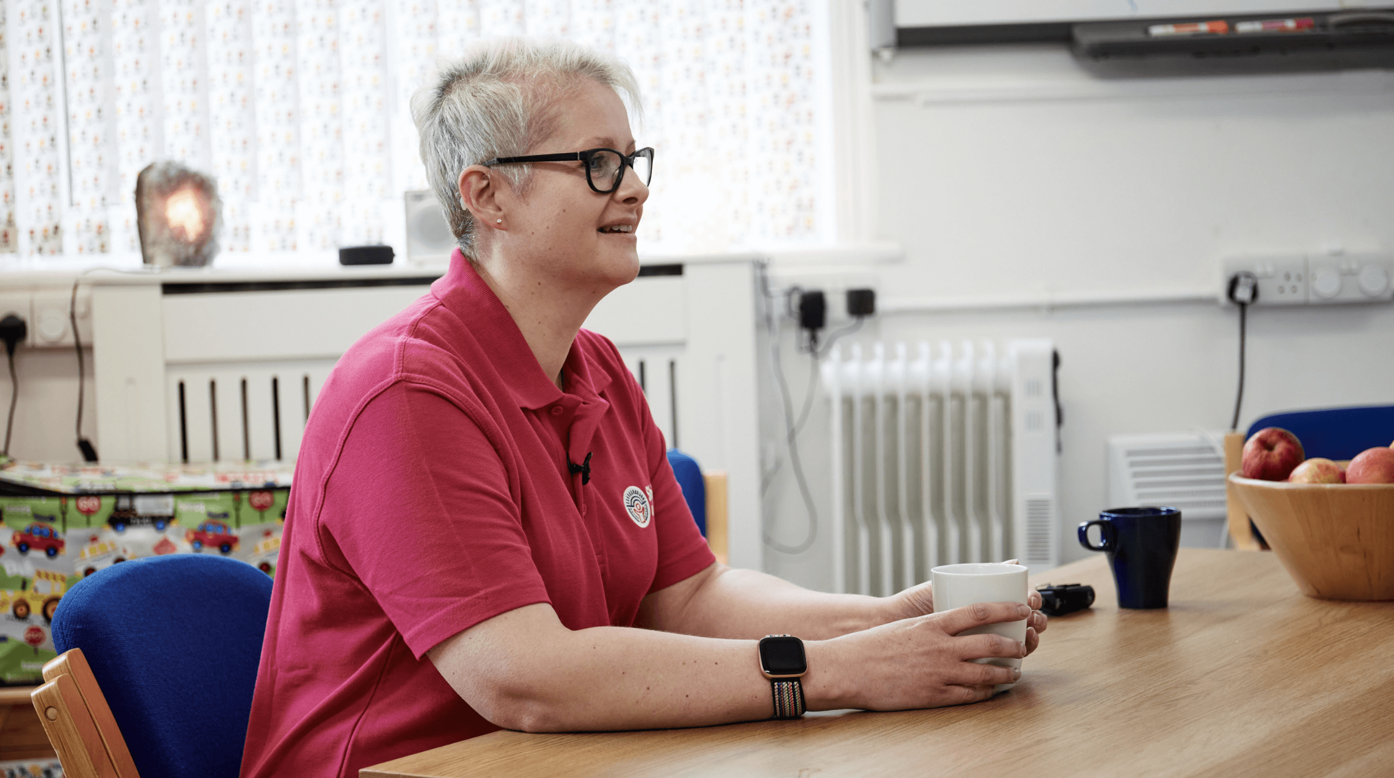
Pictured above: Sam Schoolar – Founder & CEO.



A suite of photography was created that balances sensitivity for the community and staff, with creating a consistent style and telling the story of Shine a Light. The photography focuses on the positive elements of the charity’s story to create a warm, uplifting personality.
